FIN 110 Unit 3
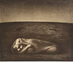
Odd Nerdrum
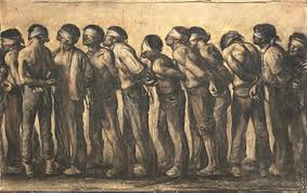
Medium: ballpoint pen on paper
Dimensions: 88 x 140 cm. (34.6 x 55.1 in.)
Date: 1982
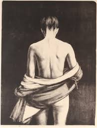
Medium: lithograph
Dimensions: 50 x 59 cm. (19.7 x 23.2 in.)
Date: 1987
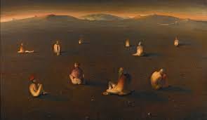
Medium: Lithograph
Dimensions: 76 x 57 cm. (29.9 x 22.4 in.)
Date: 1974
Medium: oil on canvas
Dimensions: 204 x 351 cm. (80.3 x 138.2 in.)
Date: 2001
Medium: color etching ,
Dimensions: 36 x 45.5 in. (91.4 x 115.6 cm.)
Date: 1990
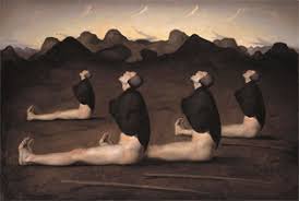
Chosen Work to Analyze: Lunatics
How is the work made?
He uses oil on canvas for the medium in this work, and it is 80.3in by 138.2in. This piece is done in with rich colour palette and has an open composition with deep perspective
Many of his pieces are recreated in lithograph, but he does all his original in oil or charcoal
What are the formal elements of the artwork?
Formal elements used to create this piece are line, shape, space, colour
The horizontal lines of the hills give the sense of space and continuum while the shallowness of them softens the composition. The lines also form the shapes of the figures that are spaced out over the composition. Space and proximity are crucial element in this work as it gives us the vast perspective of depth and the space between the figures gives us the feeling of isolation and alienation yet togetherness and community. Finally, the dark rich colours playing against the lighter goldens gives a mixture of seriousness and wonder. Together these elements create a sort of tension between the personal alienation and yet unification.
What is the context of the work?
This painting was made in 2002 while he was living in his home country of Norway. Odd is a mostly a figurative painter, and his themes and styles reference anecdote and narrative still life’s. He has declared himself a Kitsch-painter rather than the contemporary art world. Rembrandt and Caravaggio are his primary influences.
Describe the content/subject of work.
This work depicts the mythic or archetypal experience of a small group involves in a strange sort of ritual. Figures in his work are often dressed as if from another time and space.
What is the mood of the work?
There seems to be a sense serenity in this painting along with a sense of wonder as to what they might be waiting for
Mary Borgman
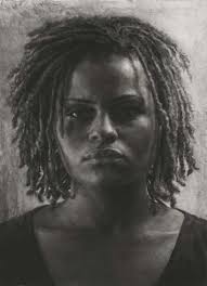
Medium: charcoal on Mylar
Dimensions: 60 x 40
Date: 20?
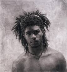
Medium: Charcoal on Mylar
Dimensions: 47 x 45
Date: 2009
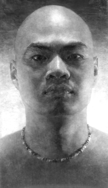
Medium: Charcoal on Mylar
Dimensions: 75 × 44 1/2 in
Date: 2006
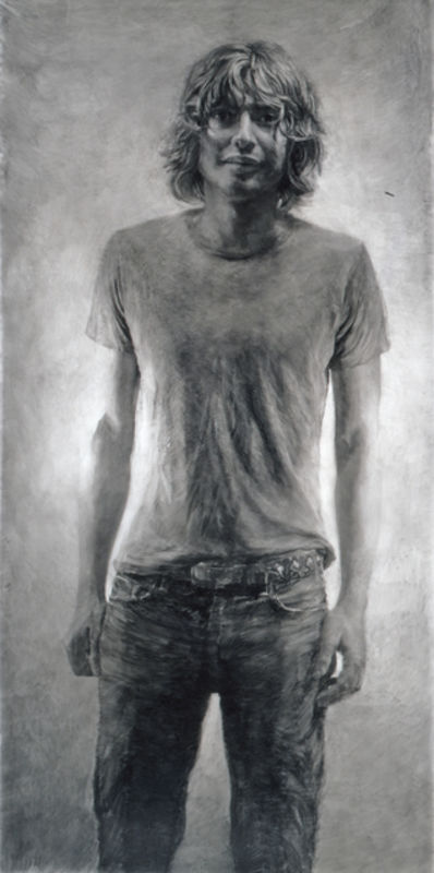
Medium: Charcoal on mylar
Dimensions: 87 × 45 in
Date: 2004
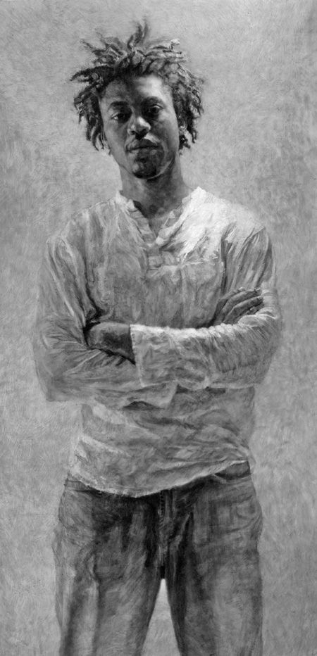
Medium: charcoal on mylar
Dimensions: 801⁄2 x 411⁄2
Date: 2008
Chosen Work to Analyze: Portrait of Chris Rubin – Standing
How is the work made?
This work, as is all her work, is charcoal on mylar. This piece is 87x45in, and again, most of her work is large and centered and generally on a slight angle.
What are the formal elements of the artwork?
The use of texture by using the charcoal in mylar drawings results in a richly gestural drawing with distinct strokes and eraser marks animating the figure and ground. The gazes of the models are also very striking and seem to be examining us as much as we are examining them.
What is the context of the work?
Mary mostly gets her subjects off the street, she prefers to sketch strangers who are casually dressed and are visually striking with eyes that show experience and wisdom, distinct shadow shapes on their face and laid-back body language.
Describe the content/subject of work.
Mary sees a potential model on the street and will approach them and ask if they will pose for pictures for pay. She meets up with them for an initial discussion where she learns about them and they decide on a date to do the shoot. She takes over 100 photos in different light. In the days after the shoot, she evaluates the underlying value pattern, zooms in on the eyes and then choses the best one. Once she has settled on her reference photo, she spends a few days simply looking at it before she starts drawing.
What is the mood of the work?
Intense yet friendly.
What are the similarities/differences between the two artists?
While both artists’ art includes human forms, they are very different. One is portraiture and the other is more figurative.
References:
http://www.artnet.com/artists/odd-nerdrum/
https://www.forumgallery.com/artists/odd-nerdrum/biography
https://en.wikipedia.org/wiki/Odd_Nerdrum
https://www.artsy.net/artist/mary-borgman
https://npg.si.edu/exhibit/drawing/borgman.html
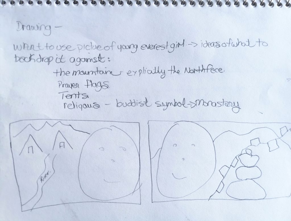
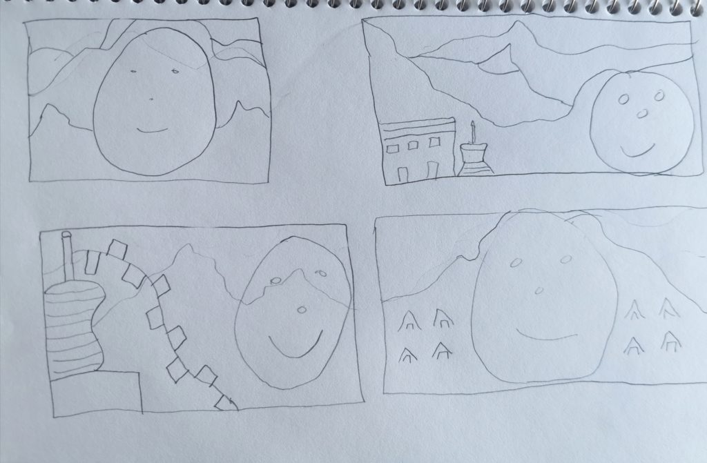
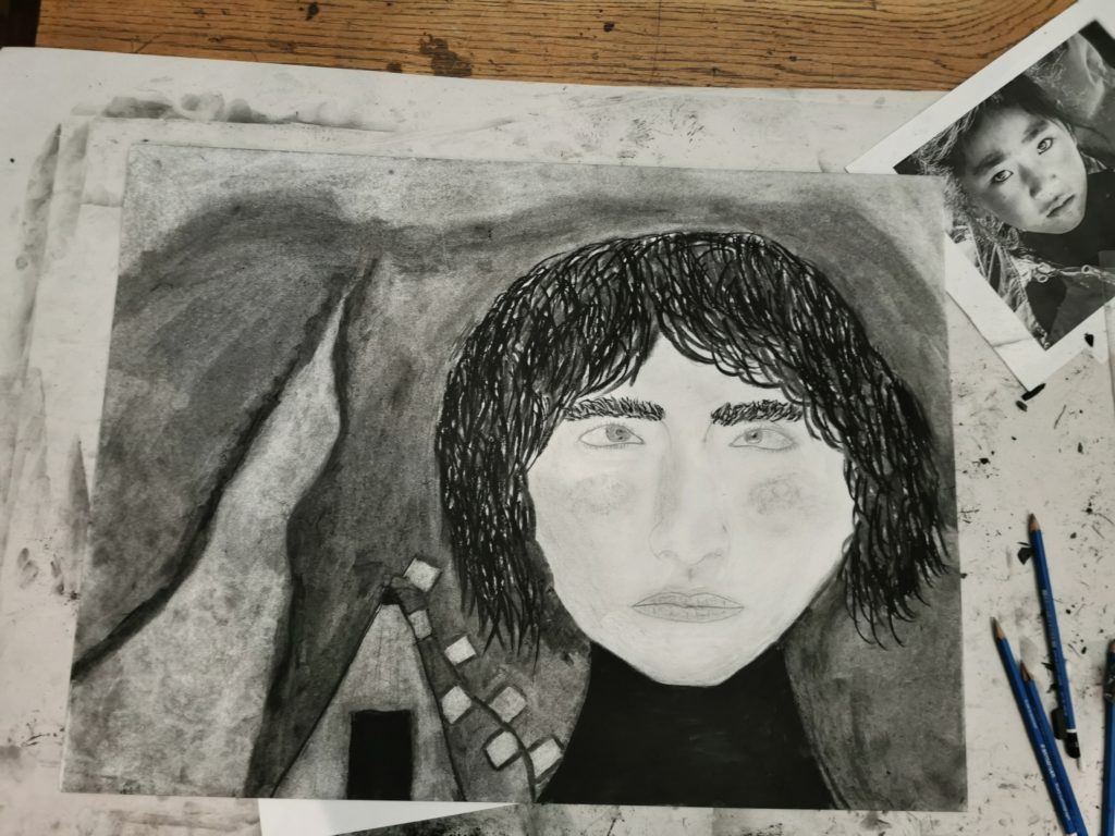
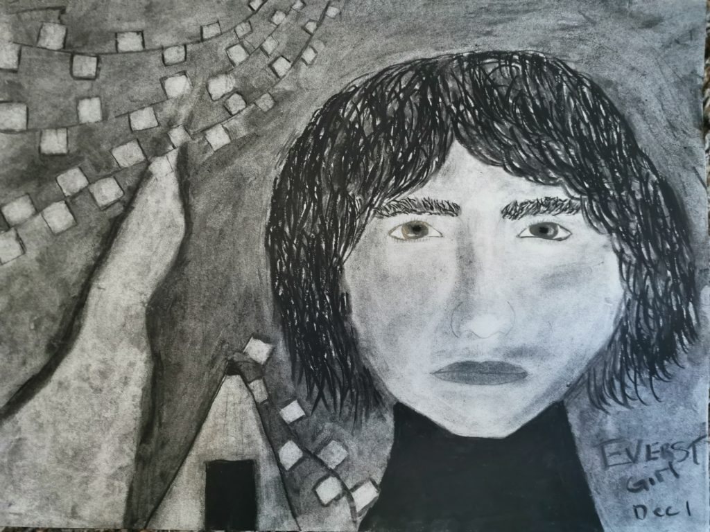
I chose to do the tent/glacier run off/prayer flags with the girl as it really represented the time I was there and saw my subject. In developing the sketch up to this point, I struggled mainly with the face. Although I think I got the face shape, I do think it is not the right size for the little girl, but I am not sure how to fix that…shorter nose?? And I had trouble with the eyes, but was able to get that fixed with some advice. The paper was a really strange texture, I think from erasing a million times, so the darkening of the face was blotchy rather than smooth. The hair too, there was layers of 2 kinds of charcoal and they did not mix well. The background I darkened up to the top and added more prayer flags, but they kind of ran through my stream. I was going to try to make the top more like mountains but I thought it would be too much in the frame. Overall I am happy with how it turned out, I could have kept tweaking and tweaking but I had already spent over 20 hrs on it. I think for my beginning level of drawing I did pretty good.
FIN 110 Unit 2
Artist #1 – Zaria Forman
5 Works chosen:
- Maldives #14; 60×90 in., soft pastel on paper, 2015.\
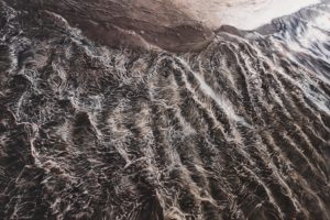
- Greenland No. 62; 47×70 in., soft pastel on paper, 2013.
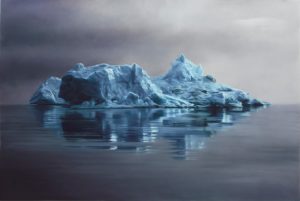
- De Vicq Glacier, Antarctica; 60×90 in., soft pastel on paper, 2016.
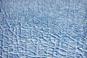
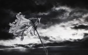
- Flower; 38×60 in., charcoal and soft pastel on paper, 2012.
- Nosara #1; 45×60 in., soft pastel on paper, 2012.
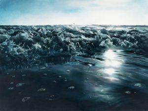
Work selected: Maldives #14
- The artist draws from memory or from her photographs and then makes all her drawings in pastel on paper. This work is 6”x90”. This piece of work, as with her others, are extremely realistic and detailed.
- Formal elements include lines, tone, texture and colour to make this drawing so realistic, and she uses movement, contrast, and pattern to organize these elements to show the turbulent incoming seas.
- “Continuing the story of polar melt, a significant contributing factor to rising seas, I followed the meltwater from the Arctic to the Equator. I spent September 2013 in the Maldives, the lowest and flattest country in the world, collecting images and inspiration to create a body of work celebrating and representing a nation that could be entirely underwater within this century.” Zaria Forman documents climate change with pastel drawings. She travels to remote regions of the world to collect images and inspiration for her work, which is shown worldwide. Her work explores moments of transition, turbulence and tranquility in the landscape and their impact on the viewer.
- She has tried to communicate through her art the importance of recognizing the dangers of climate change but has kept a hopeful mood to her drawings. I really do feel the transition, turbulence, and tranquility she is trying to get across; we see the rough seas she has made, but we also see light on the edges of the drawing that bring some hope.
- Both Deborah and Zaria share the same passion for bringing awareness to topics that cannot be ignored whether socially or environmentally. Zaria’s work holds a bit more hope, with her lighter colours, tones, and use of light. Where Deborah’s work is much more haunting and darker with her use of 2D, mylar, digital print and the juxtaposition of it all.
- I chose these two artists as this is something I have wanted to take on with my photography.
Artist #2 – Deborah Rockman
5 Works chosen:
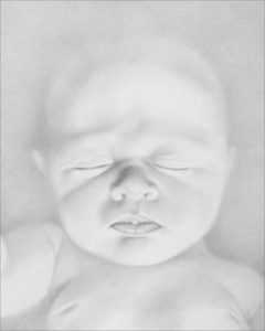
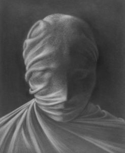
- Danger of Being Born VII; Graphite on Paper; Image Size: 10″ x 8″; Paper Size: 29″ x 23″ 2004.
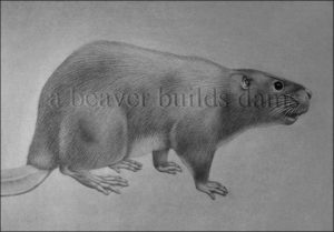
- A Beaver Builds Dams; Charcoal on Paper and Vinyl on Glass; 23″ x 27″, 20?
- Study #1 for Death Dream; Graphite on Gessoed Paper; 29″ x 23″, 200?
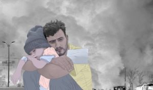
- Companions 9 (While Syria Burns); Low-Tech Digital Drawing and Digital Collage (Digital Print); 14.75″ x 25.5″, 2016.
- The Space Between Us (10); Colored Pencil on Mylar over Digital Inkjet Print; 14.5″ x 17.75″, 200?
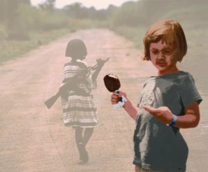
Work selected: The Space Between Us (10)
- This artist used colored pencil on mylar over digital inkjet print to capture disparity in the life experiences of children. Her use of 2D, contrast, space, colour and texture are some of the technical qualities she used here to help us see the inequalities. She also gives us a strong metaphorical visual element with the combining of the drawing and pictures and the way one is faded and one is bright.
- This piece is part of a series showing the disparity of life experiences of children. Through juxtapositions she shows us two children holding items – one a gun and one an ice cream bar –a childhood of abundance and one of deprivation. She places the child with the gun in the background and veiled by mylar, while the child with the ice cream is upfront and shown in colour.
- Deborah Brockman is a form Professor, an author, and an artist that with her work explores social and cultural injustices and inequalities.
- This piece and the series itself is quite dark and depressing. The stark reality is hard to view. “Somewhere in the space between us, when one suffers, we all suffer.”
- Both Deborah and Zaria share the same passion for bringing awareness to topics that cannot be ignored whether socially or environmentally. Zaria’s work holds a bit more hope, with her lighter colours, tones, and use of light. Where Deborah’s work is much more haunting and darker with her use of 2D, mylar, digital print and the juxtaposition of it all.
- I chose these two artists as this is something I have wanted to take on with my photography.
Sources viewed:
https://www.artsy.net/artist/zaria-forman
https://www.ted.com/speakers/zaria_forman
https://www.artprize.org/57379
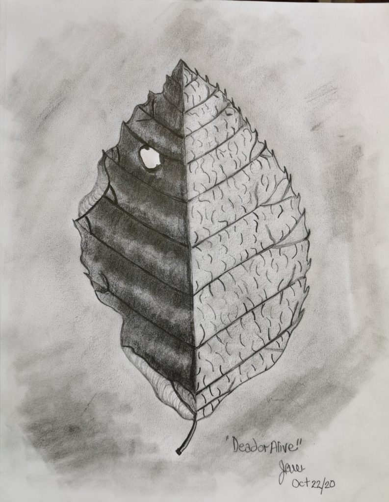
FIN 110 Unit 1
Ecce Homo, 1510
Weekly Sketches
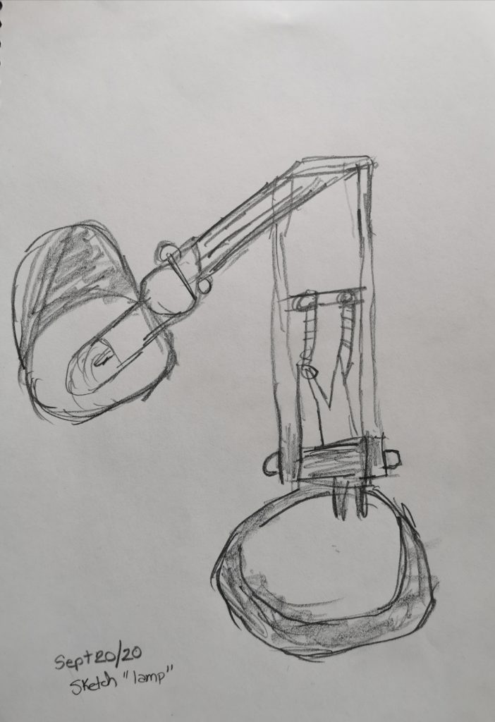
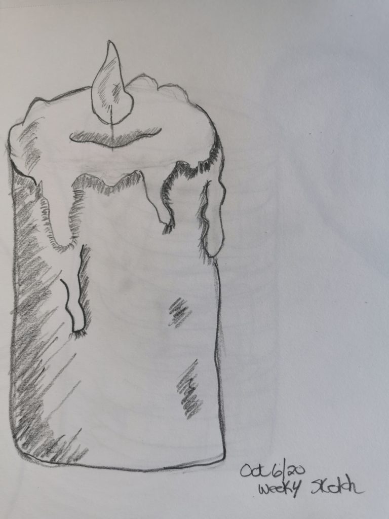
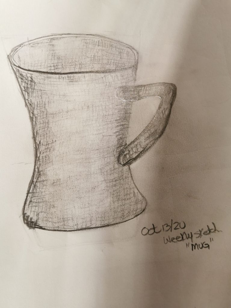
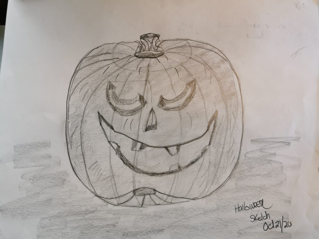
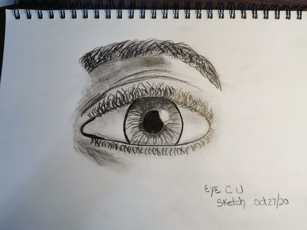
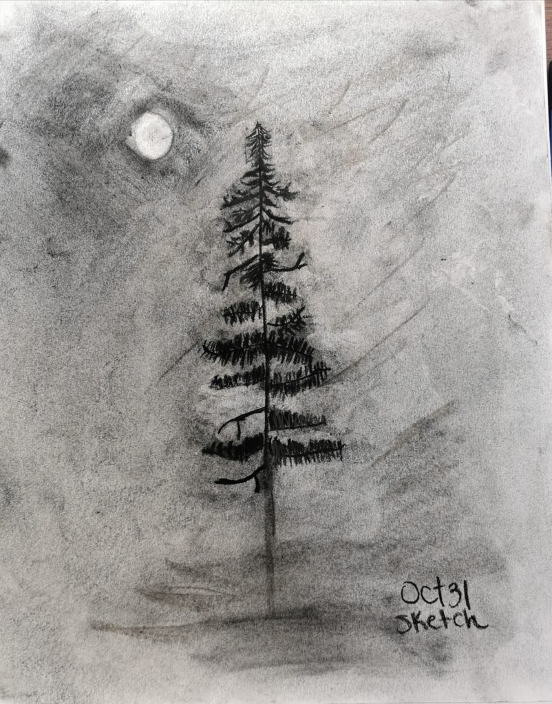
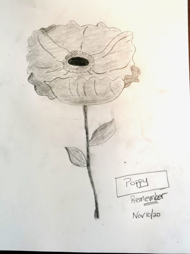
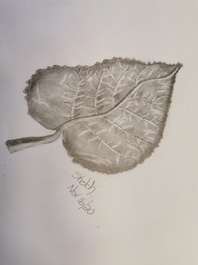
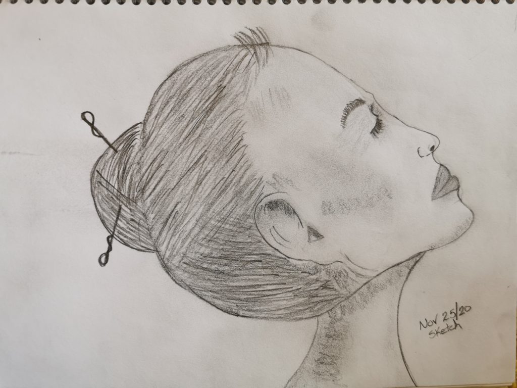
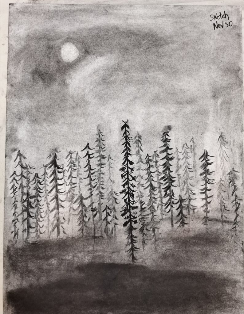
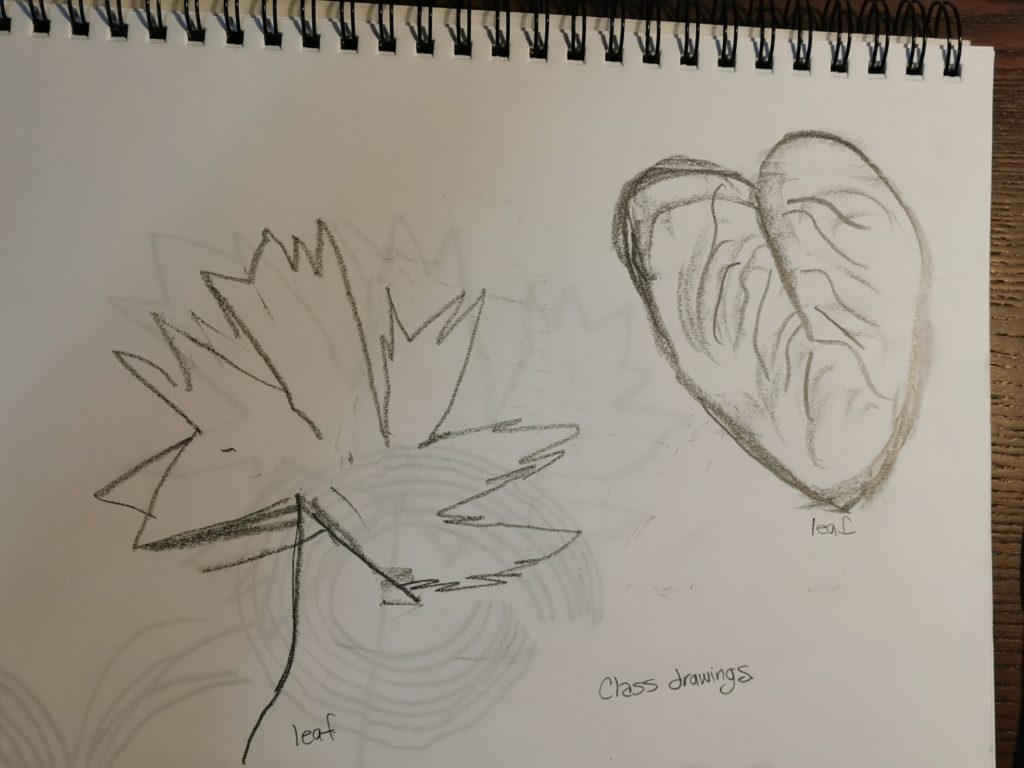
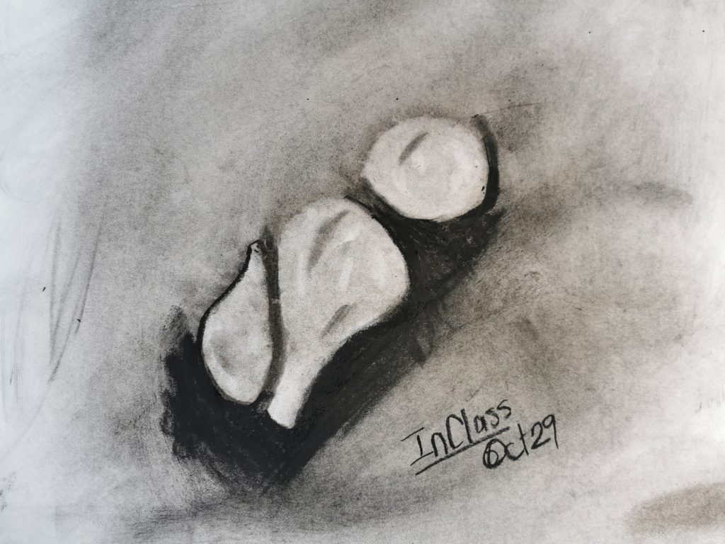
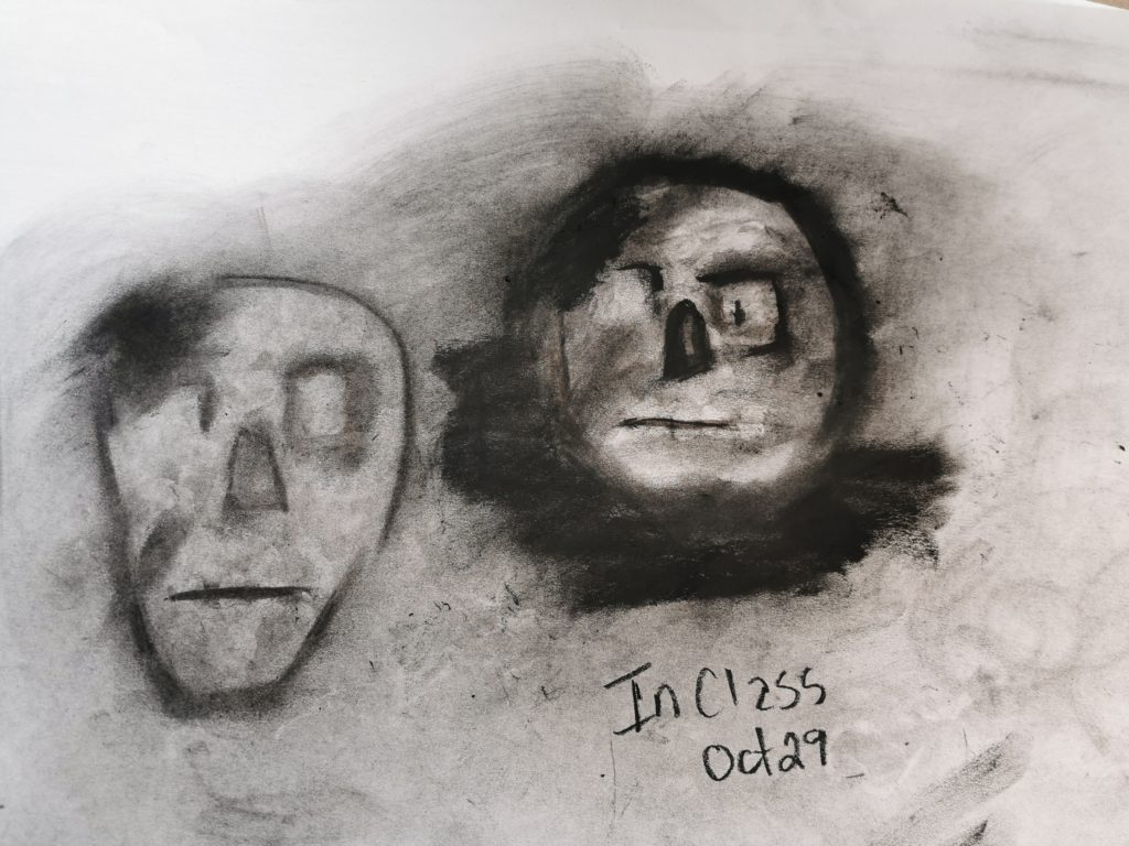
In Class Drawings
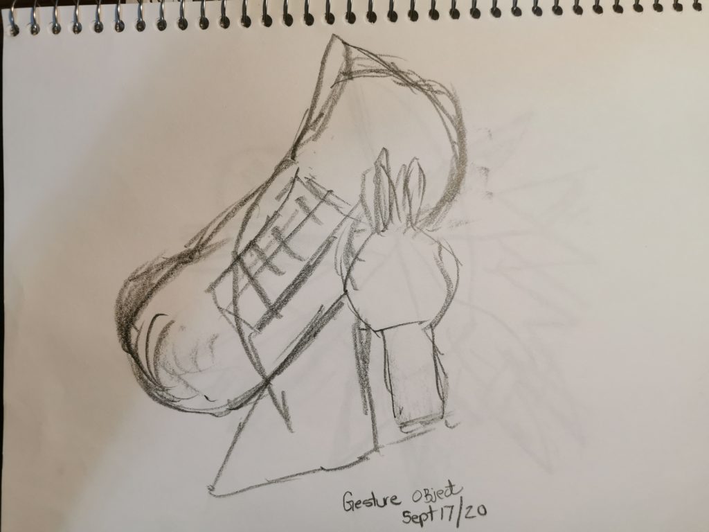
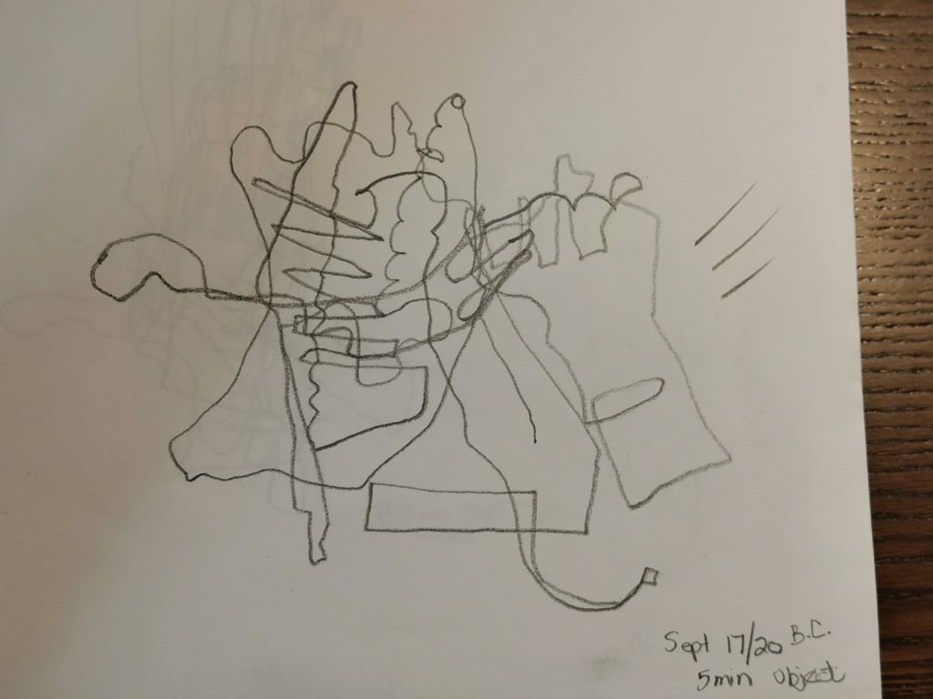
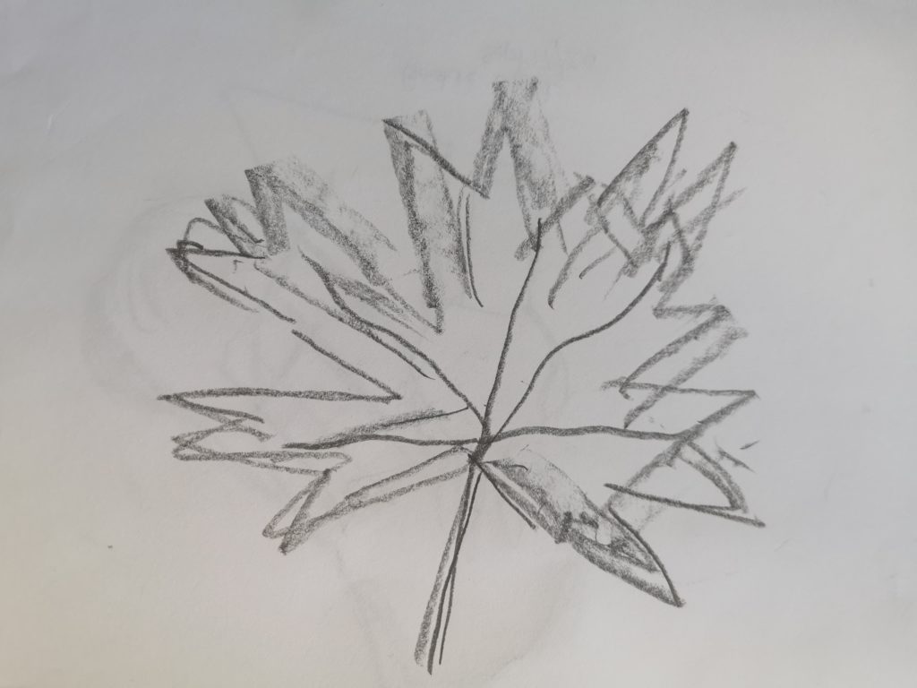
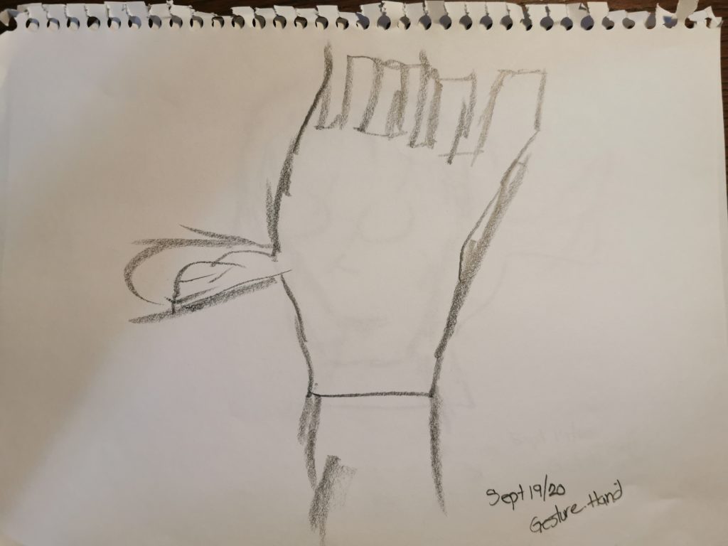
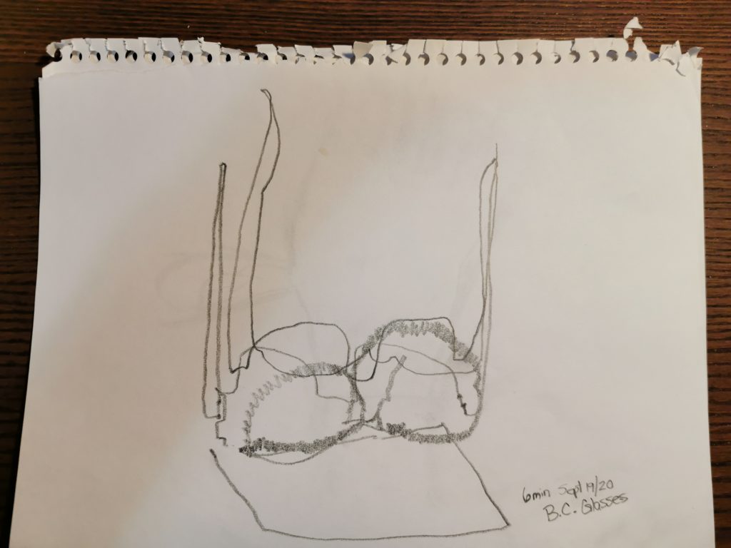
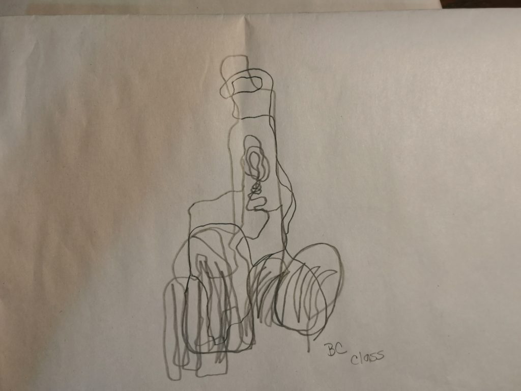
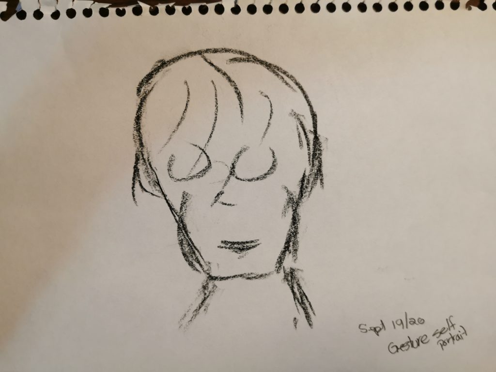
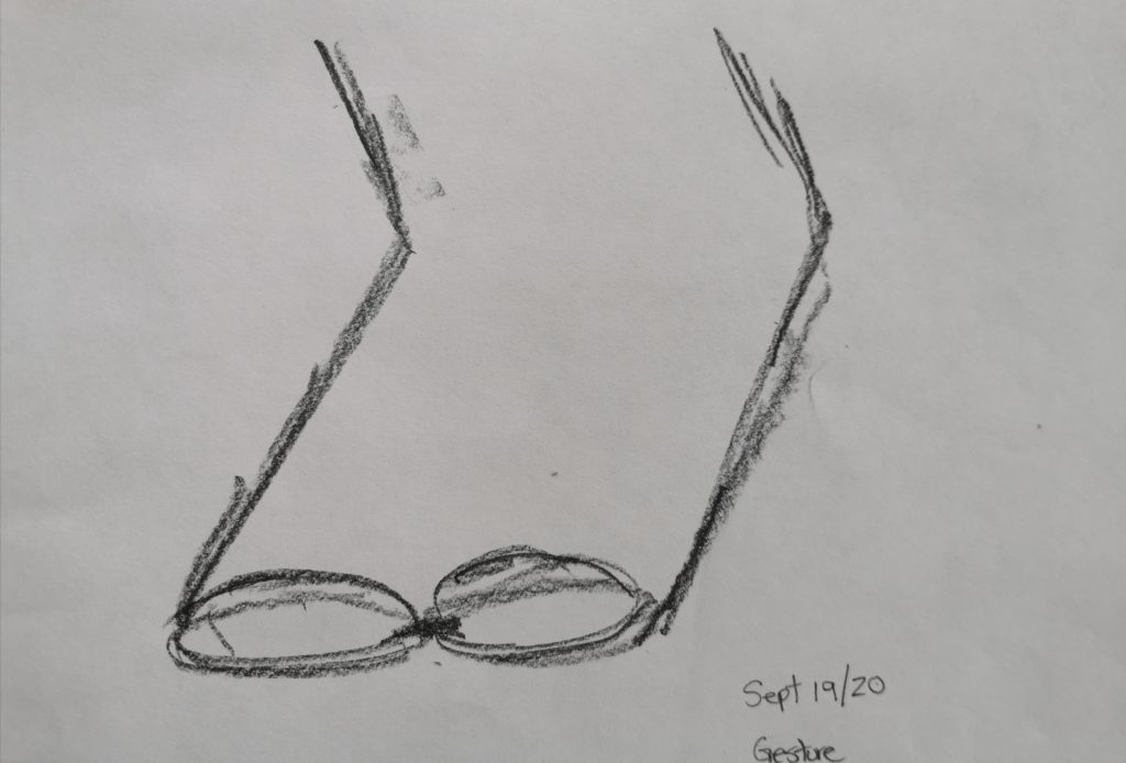
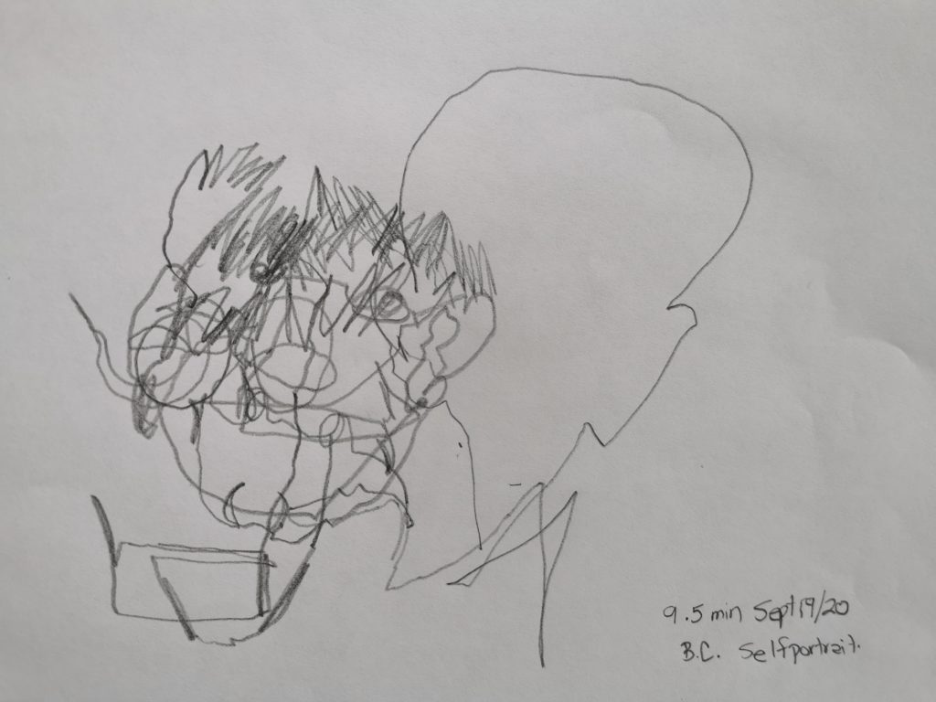
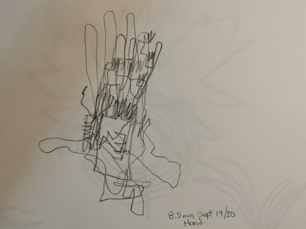
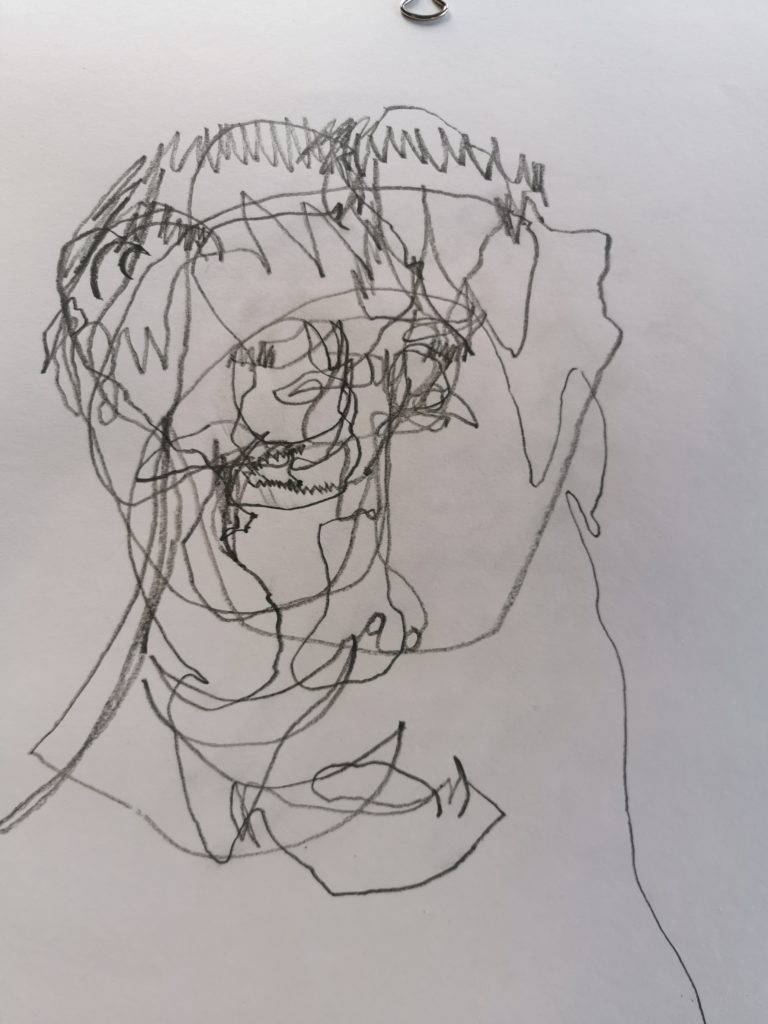
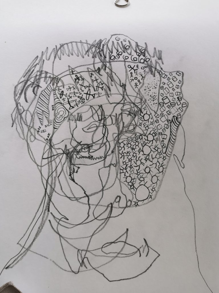
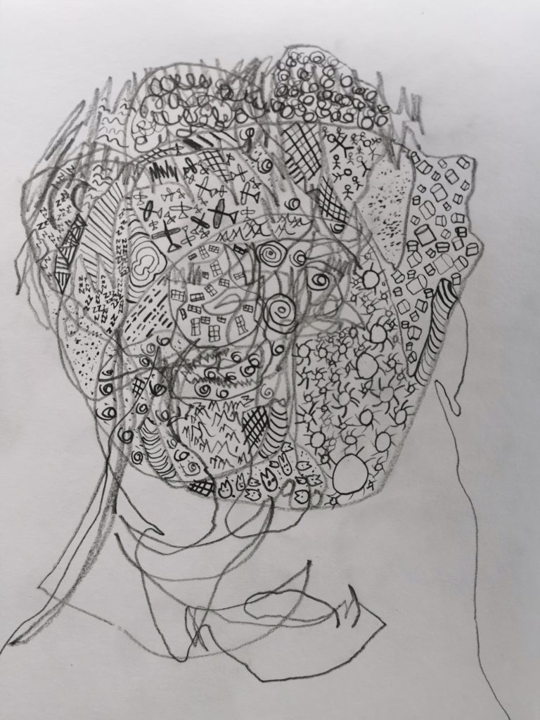
Blind Contour Drawing
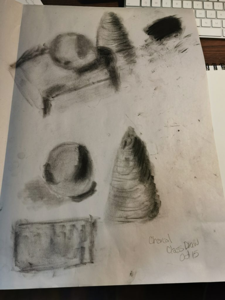
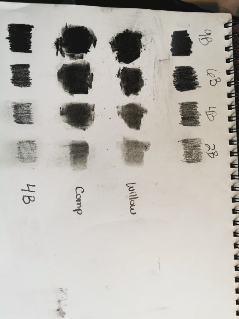
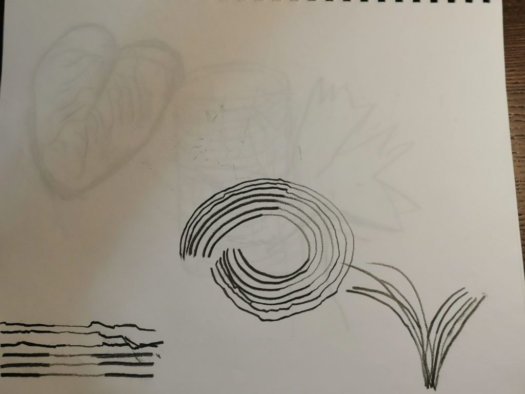
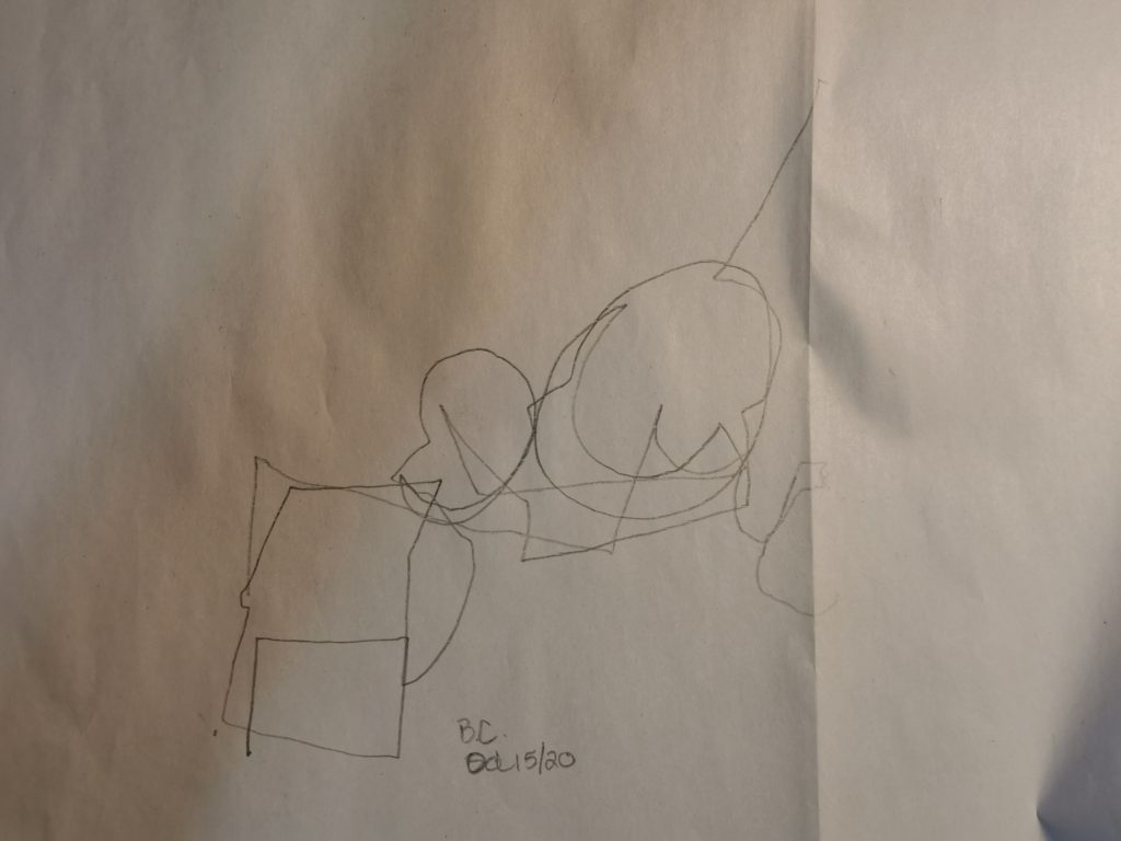
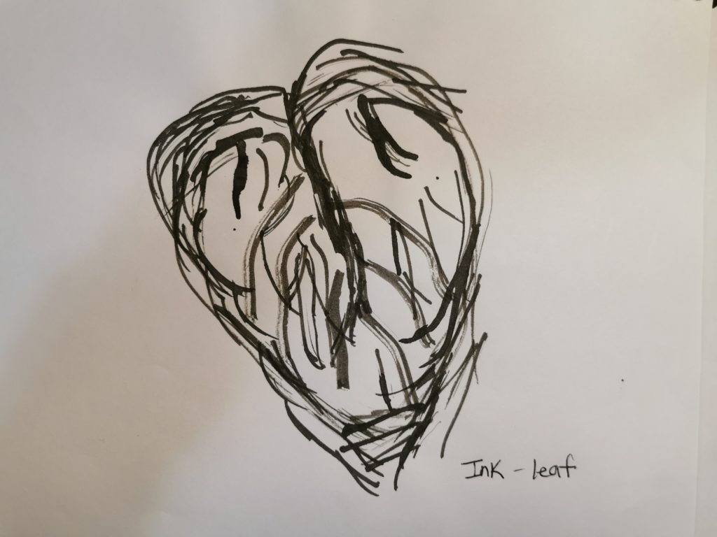
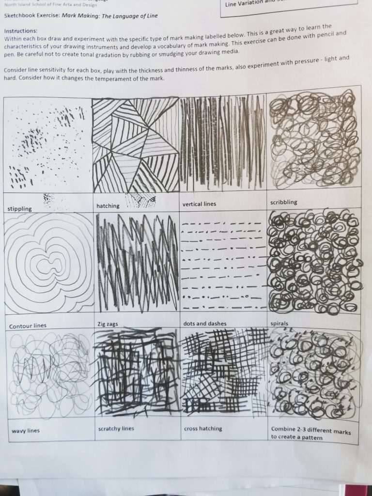
Value Scale
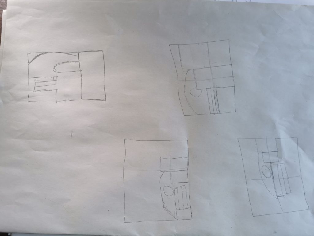
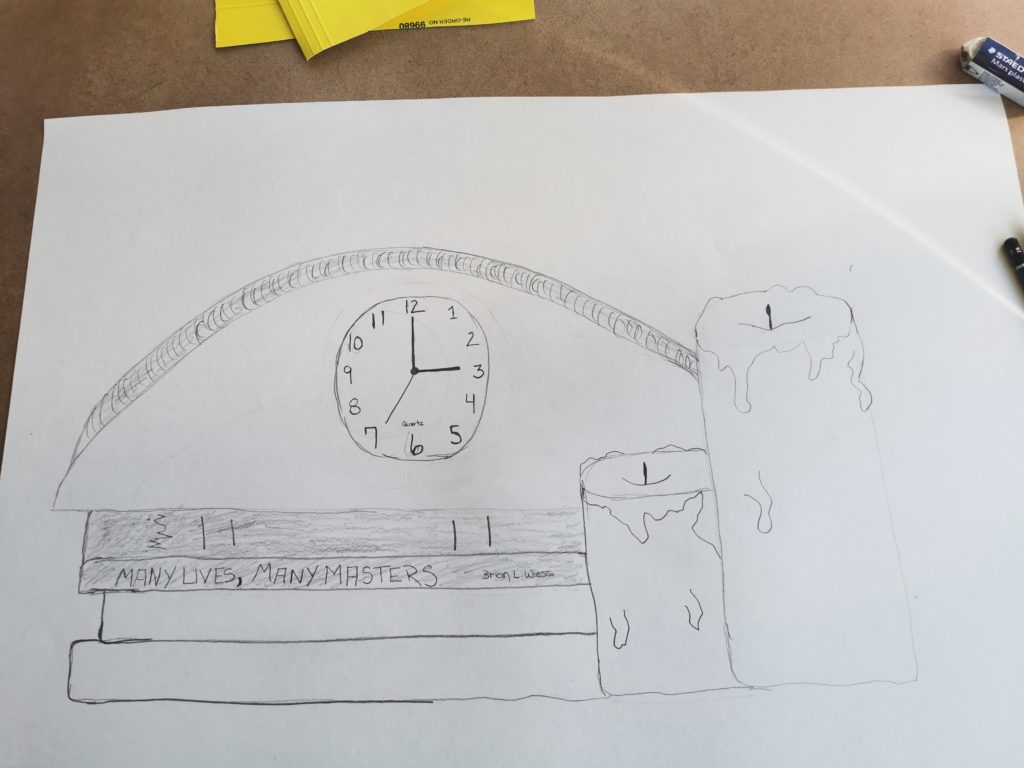
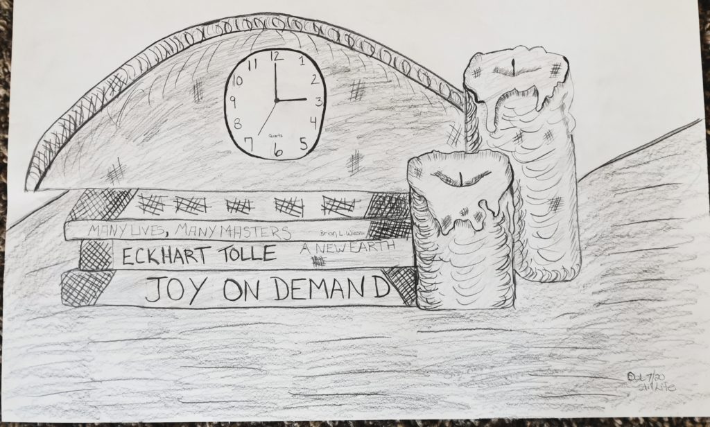
Applying Value
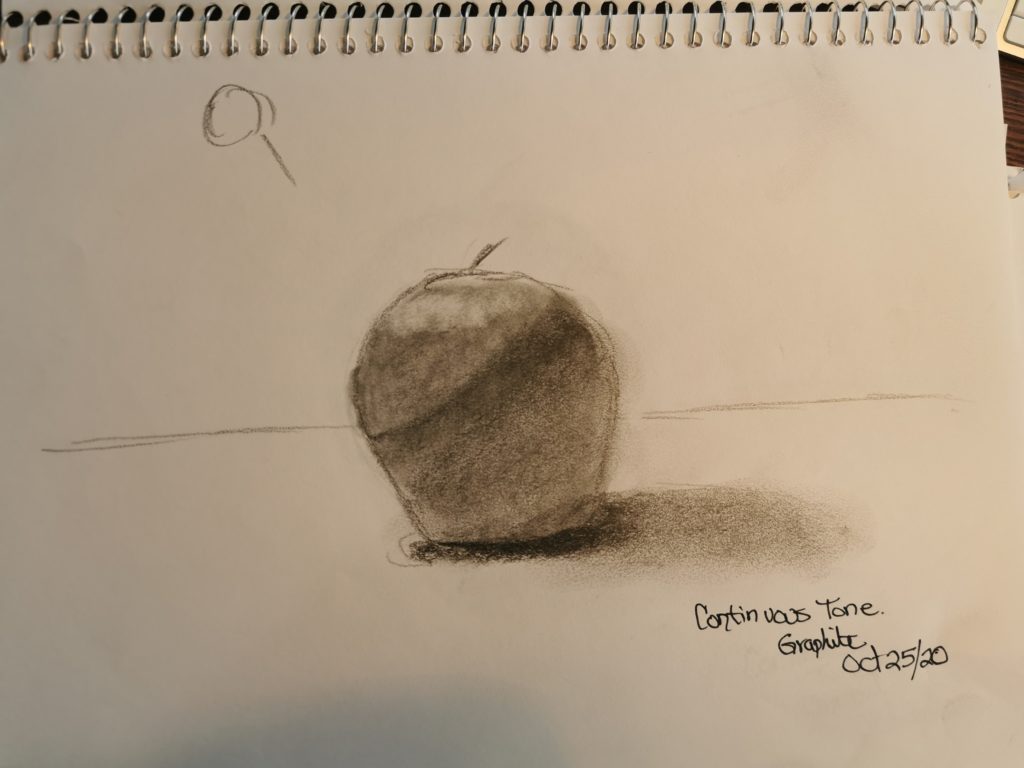
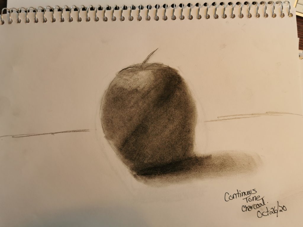
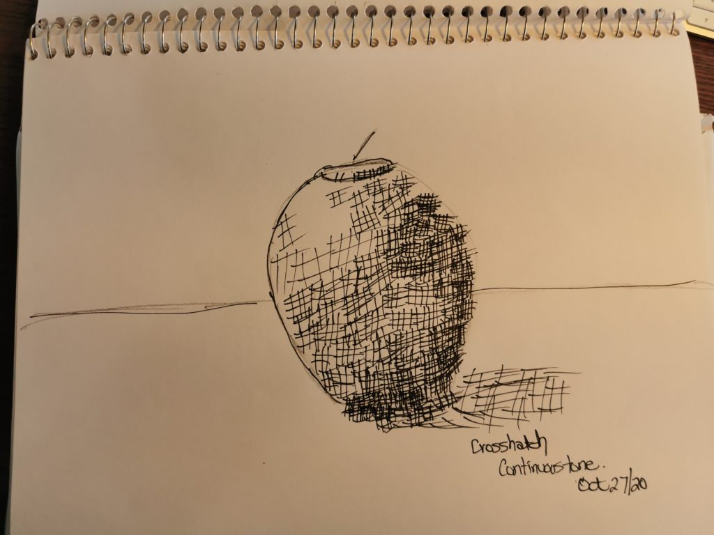
Critique #1


Value Scale
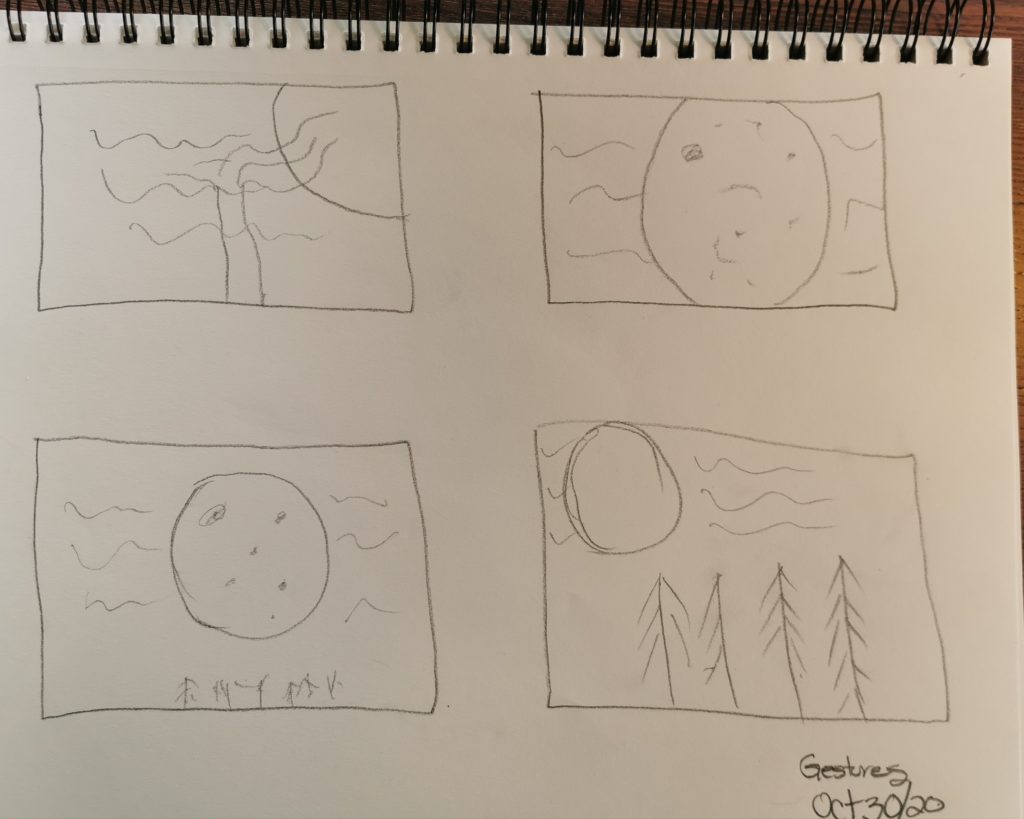
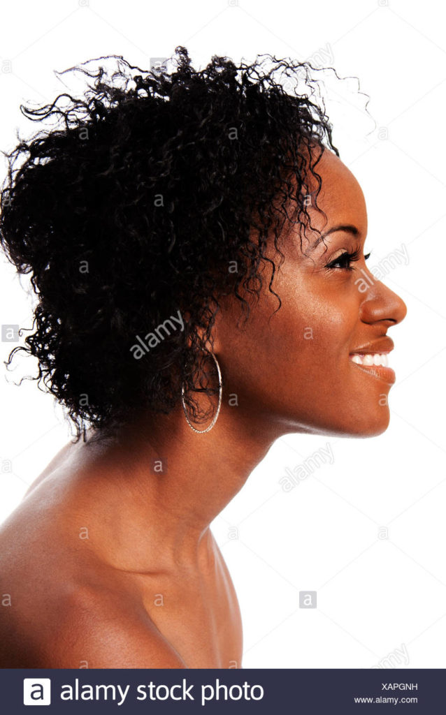
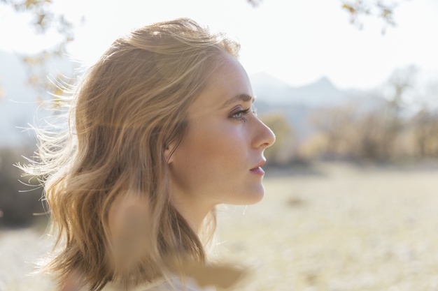
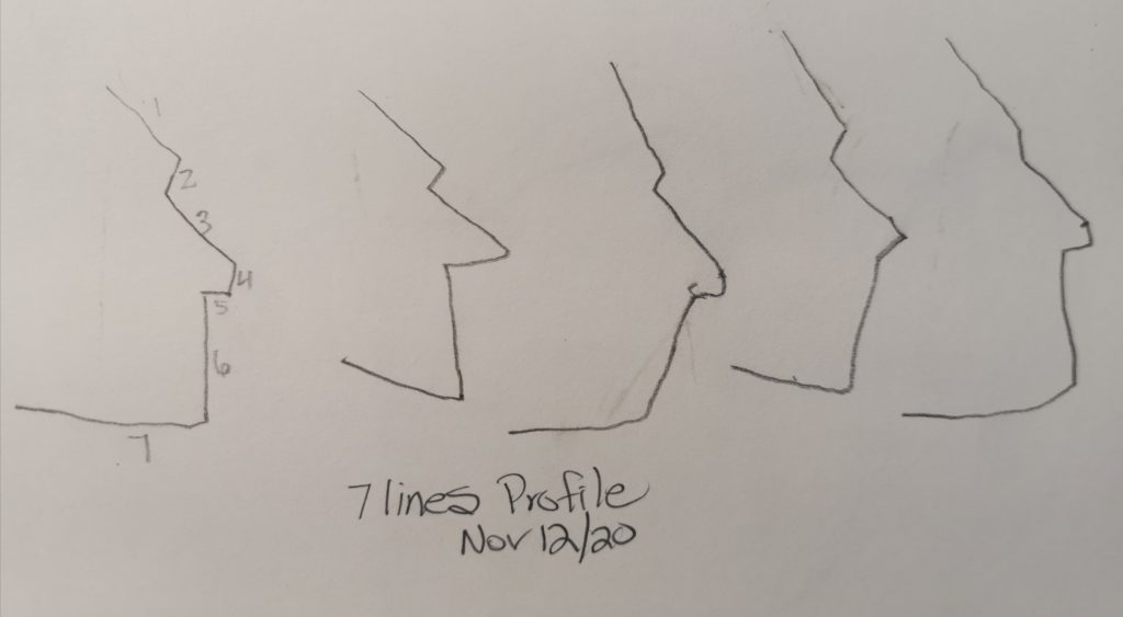
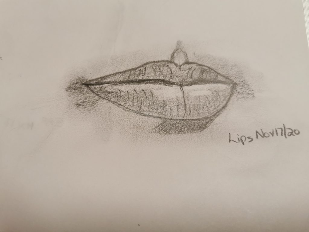
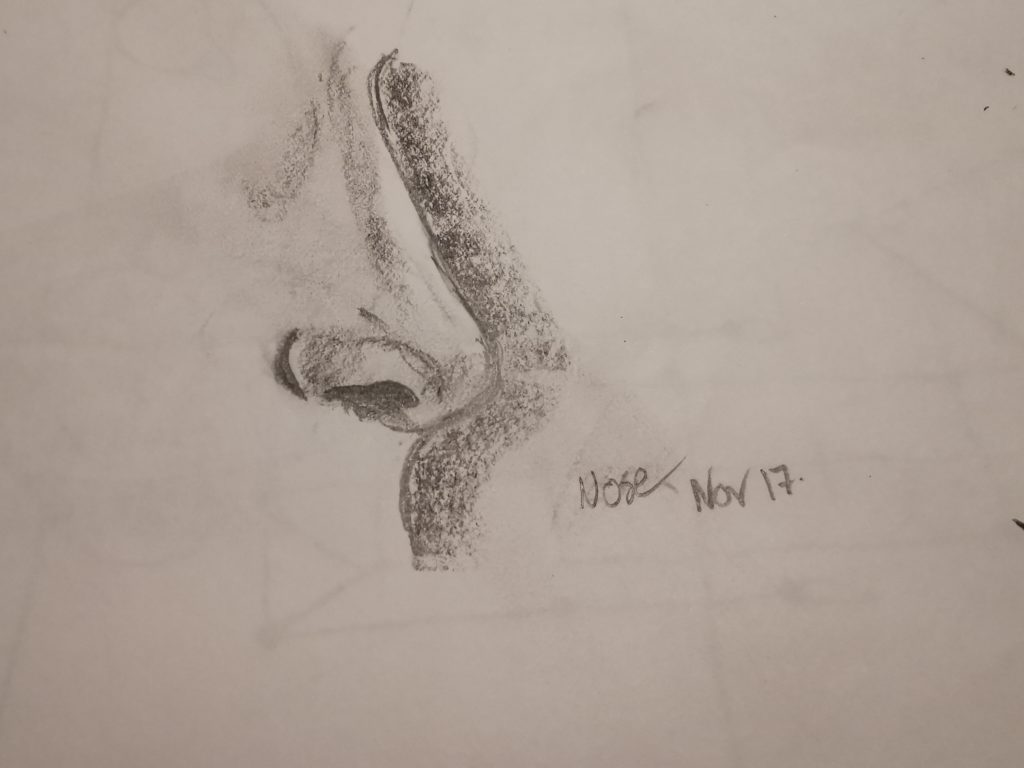
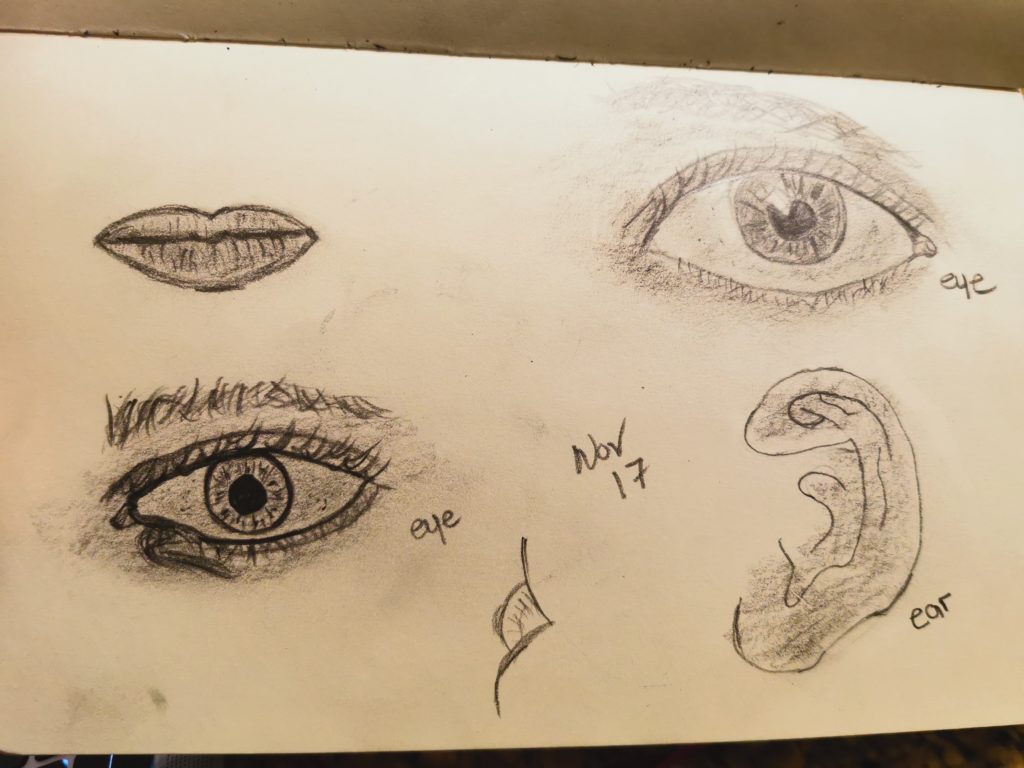
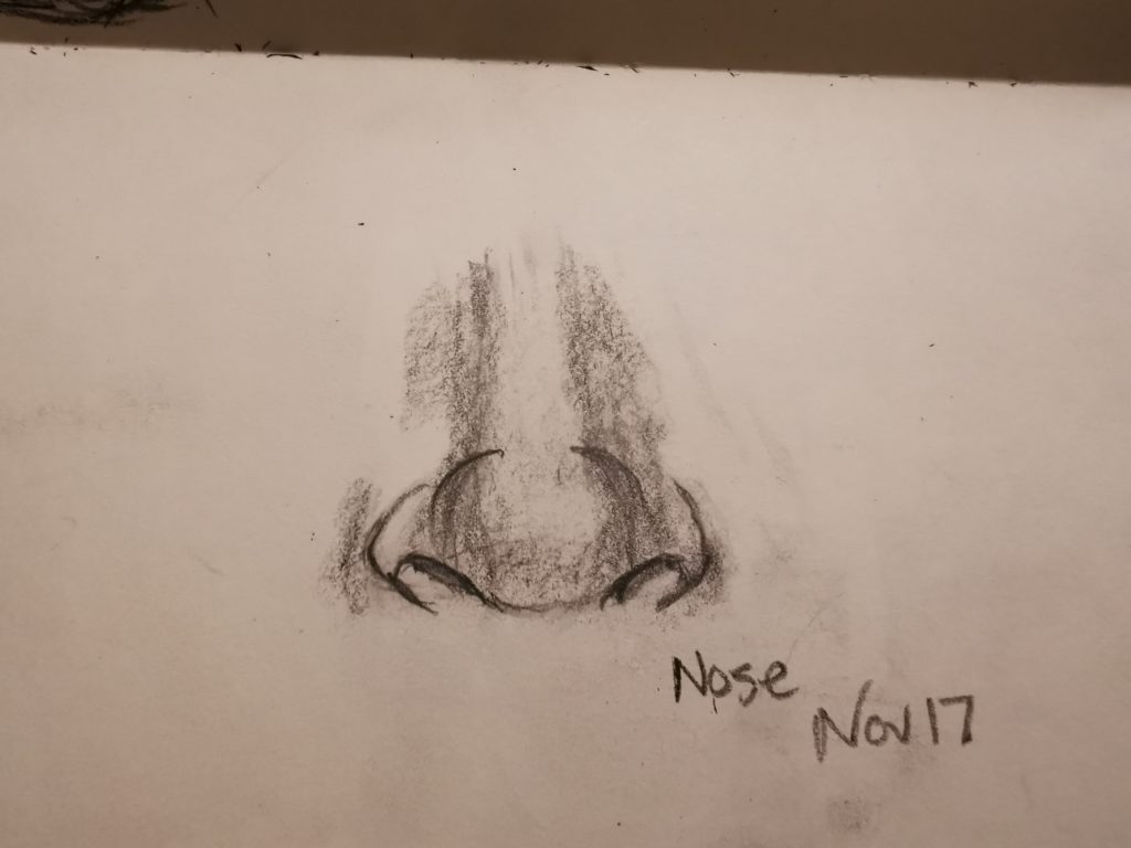
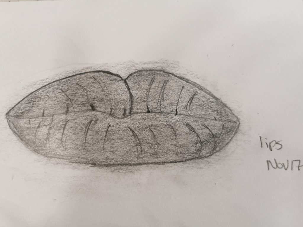
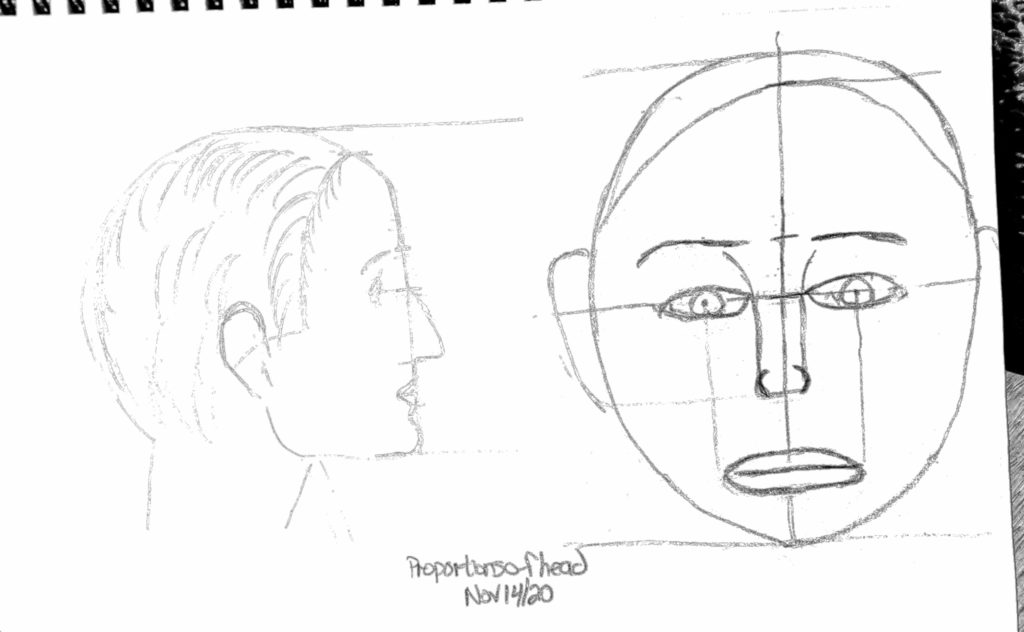
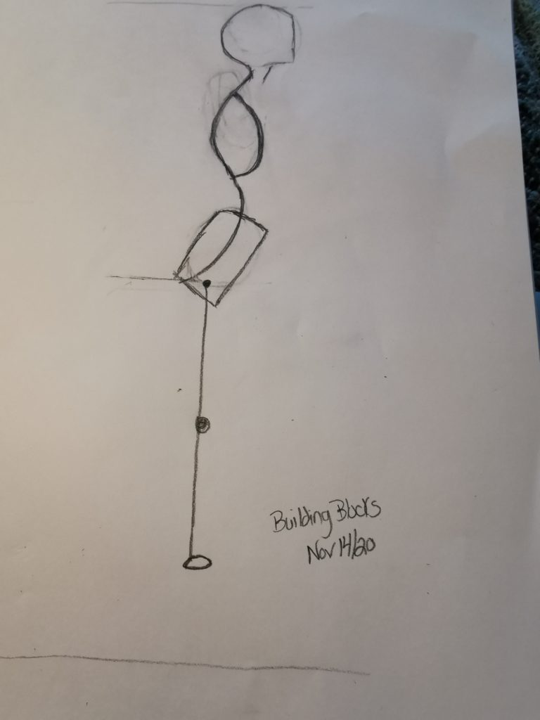
Portrait Features and Human Forms

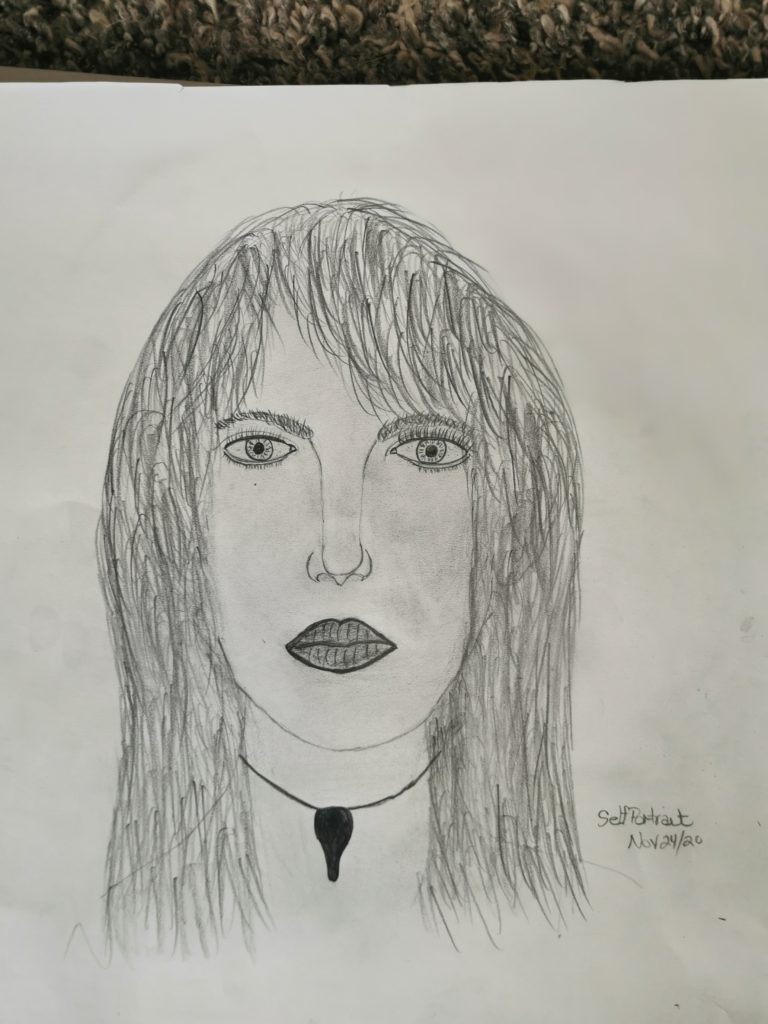
Self Portrait
